Appsumer
Platform Modularization
Appsumer had a powerful function on their platform that allows clients to use flexible dashboards, reports and insights powering their mobile apps. The platform itself was very complex, and the dashboard experience was minimal, and hard to perform the target behavior(s).
It was created with the purpose that in-house data teams would work with the client(s) data and automate it themselves, or setup integrations manually. As the platform gained much more success and recognition in the market, clients wanted to take control over their own data implementations, and customise their dashboard and experience. So now we had new problem to solve: how can we make the experience simple, clear and easy for the clients to use themselves.
"Compulsive modernization is the insatiable desire to change and grow".
— Samuel Wilson
Role
Lead UX/UI designer, implementing 1 week design sprints per new feature/function. Compiling market research, and competitor analysis, and delivering new UI components with specs and interaction flows to developers.
Deadline
4 weeks to launch new sidebar and top bars for the dashboard experience.
Team
Product owner
1 Data Scientist/analyst
2 Frontend developers
3 Backend engineers
What problem are we solving?
Problem Statement
Appsumer platform must now be exposed to clients - having them customize their dashboard, data tables, and led their own implementations. The current state of the platform was created for in-house data teams to use, therefore lacking in both UX and UI. We need to refresh and modernize core features and functions of the platform in order for clients to utilise it themselves.
Objective
To overhaul the current dashboard and it’s core features such as top navigation, features bar, sidebar, tiles, and view options. Also the new login, signup and profile pages of the platform need to have a simple user experience, complementing it with fresh UI.
Strategy
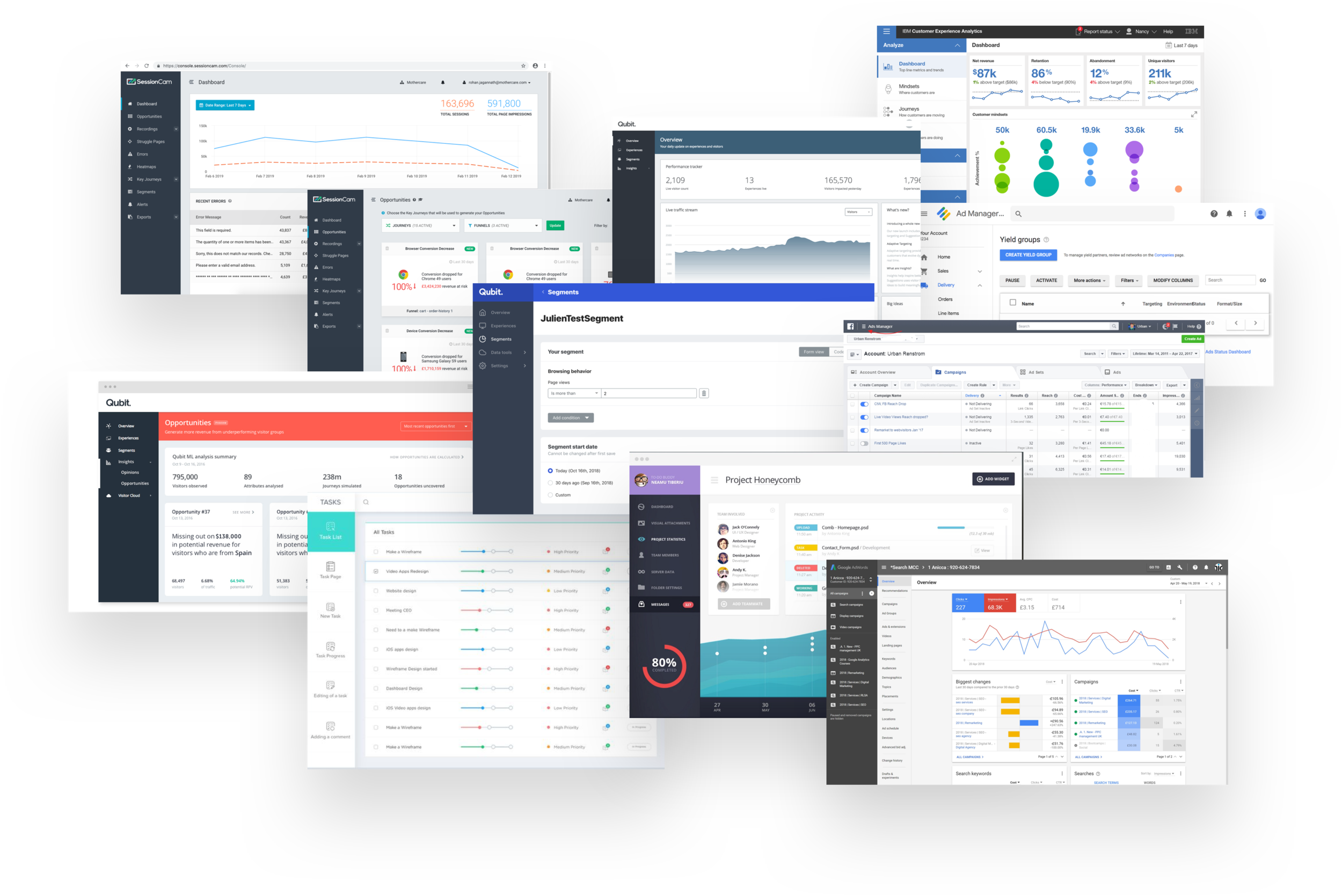
To firstly analyse, compare and scope the market out, and identify other platforms (direct, indirect) to that of Appsumer, finding trends, and common UX patterns. I worked closely with the CEO, Head of Product, and data scientists to ensure we have designed and created user friendly features and dashboard components that clients can use with ease. We need to get out both top bar (main navigation) and new sidebar for the dashboard. Then, follow up with certain features, and explore the login/signup screens, as well as the integration pages.
Research & Findings
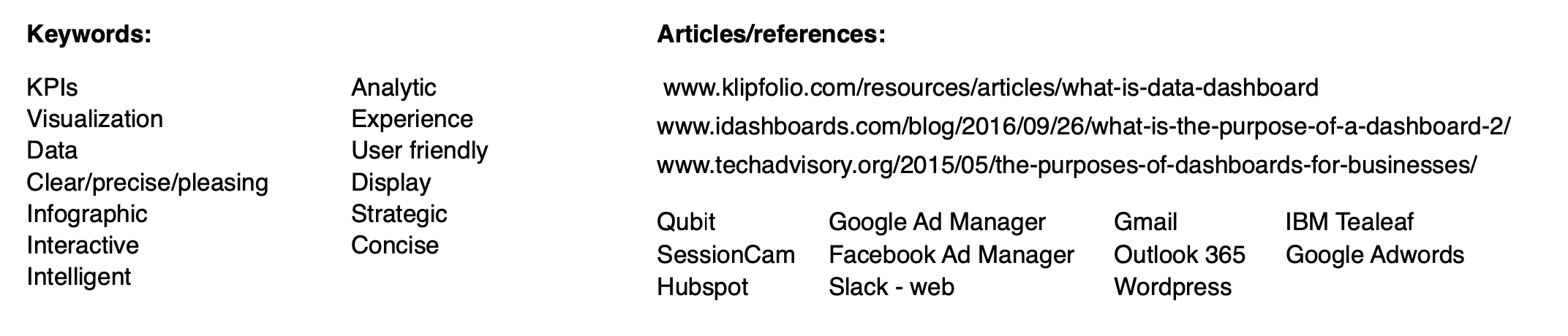
Purposes - clients and users alike
Allows you to visualize KPIs and metrics (web-based)
sets /lays out strategic data for the user at glance
Business intelligence tool that displays visual data which is understood immediately.
A form of combining an infographic with core data
Allows for user/client control and management of information at bulk
With both interactive and visual data, users can gauge business goals
Dashboards can be automotive and intelligent platforms
Users don’t need to go to multiple sources to track their data
Where does our product fit in their work or life?
How are they used?
To format metrics and data into visual graphs, charts, tables, reports and videos
Allows the to customise their dashboard experience, in which, best suites their business
needs and goals
Keeps track of the influx of data and reports coming in from third party sources
Analyze live reports fast and efficiently, and get marketing insights
Take action with regards to campaign management, analytics, tests and recordings.
They can generate and send detailed reports out to both client and business
Mood Board
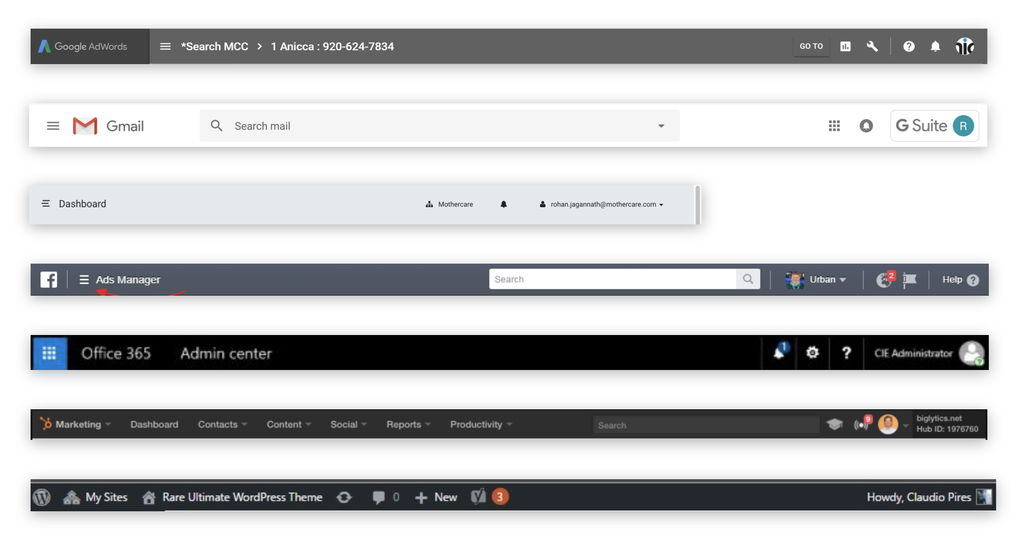
Top bar / main navigation
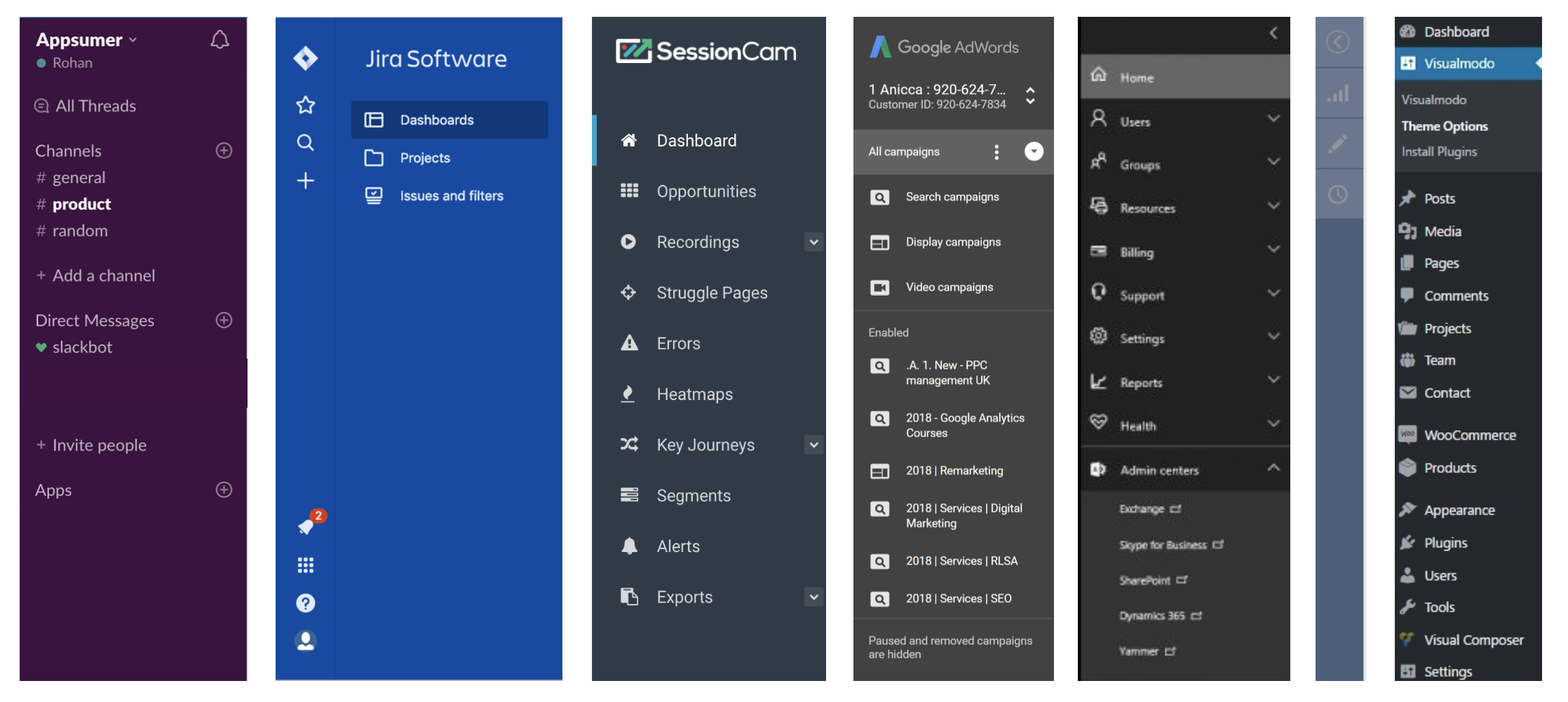
Other Sidebars
Download and read the full competitor research below
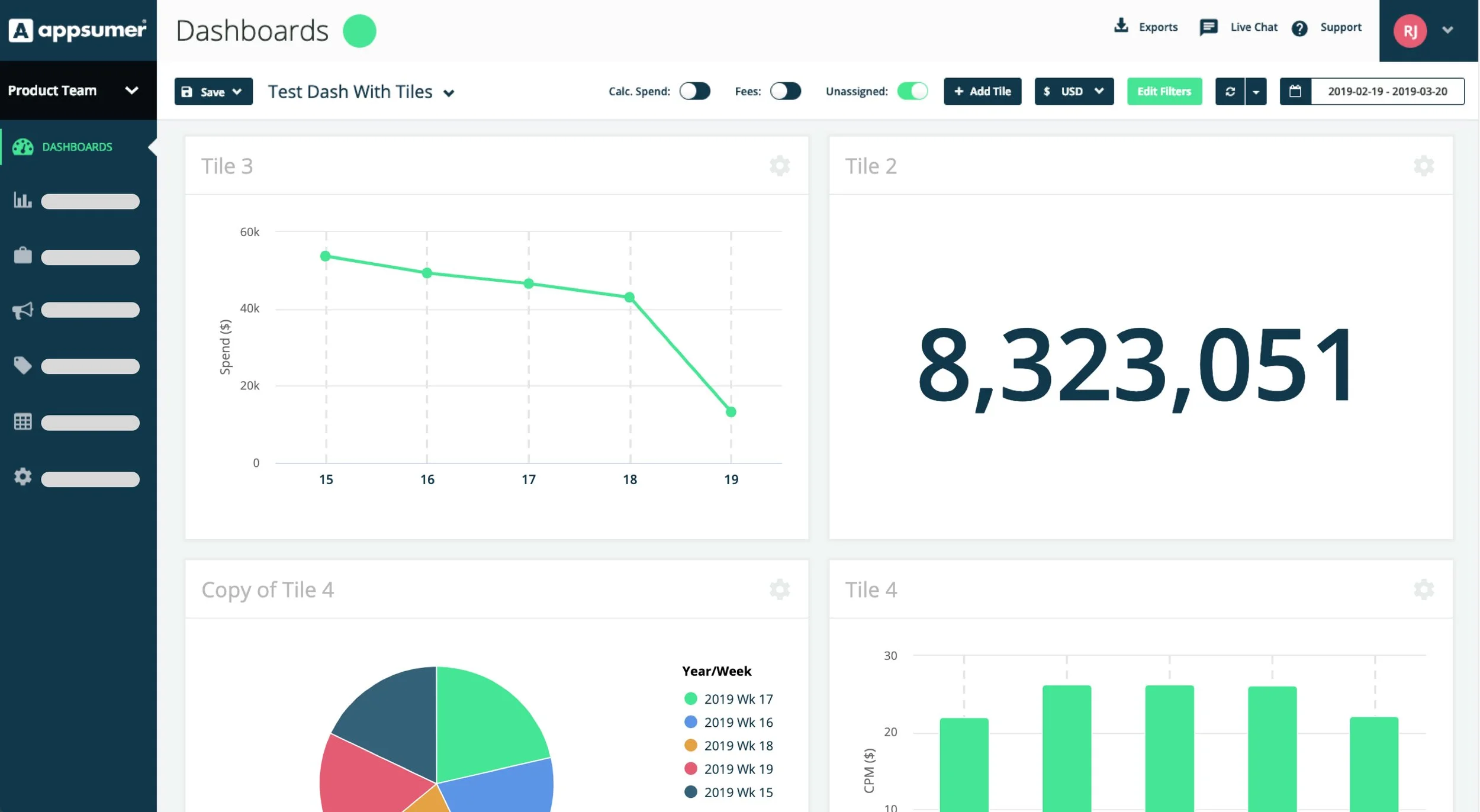
Current Dashboard implementation
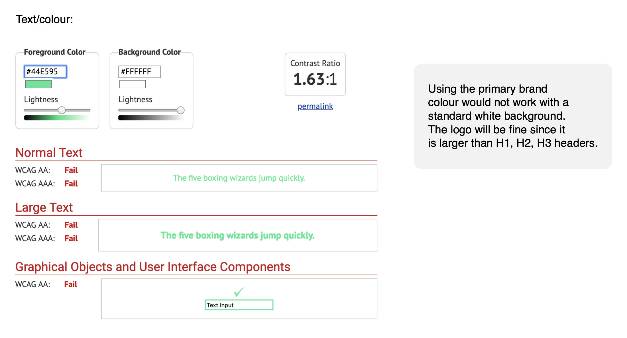
Accessibility check on type and colour
1.0
Dashboard
(1.1)
Sidebar
Lo-fi wireframes
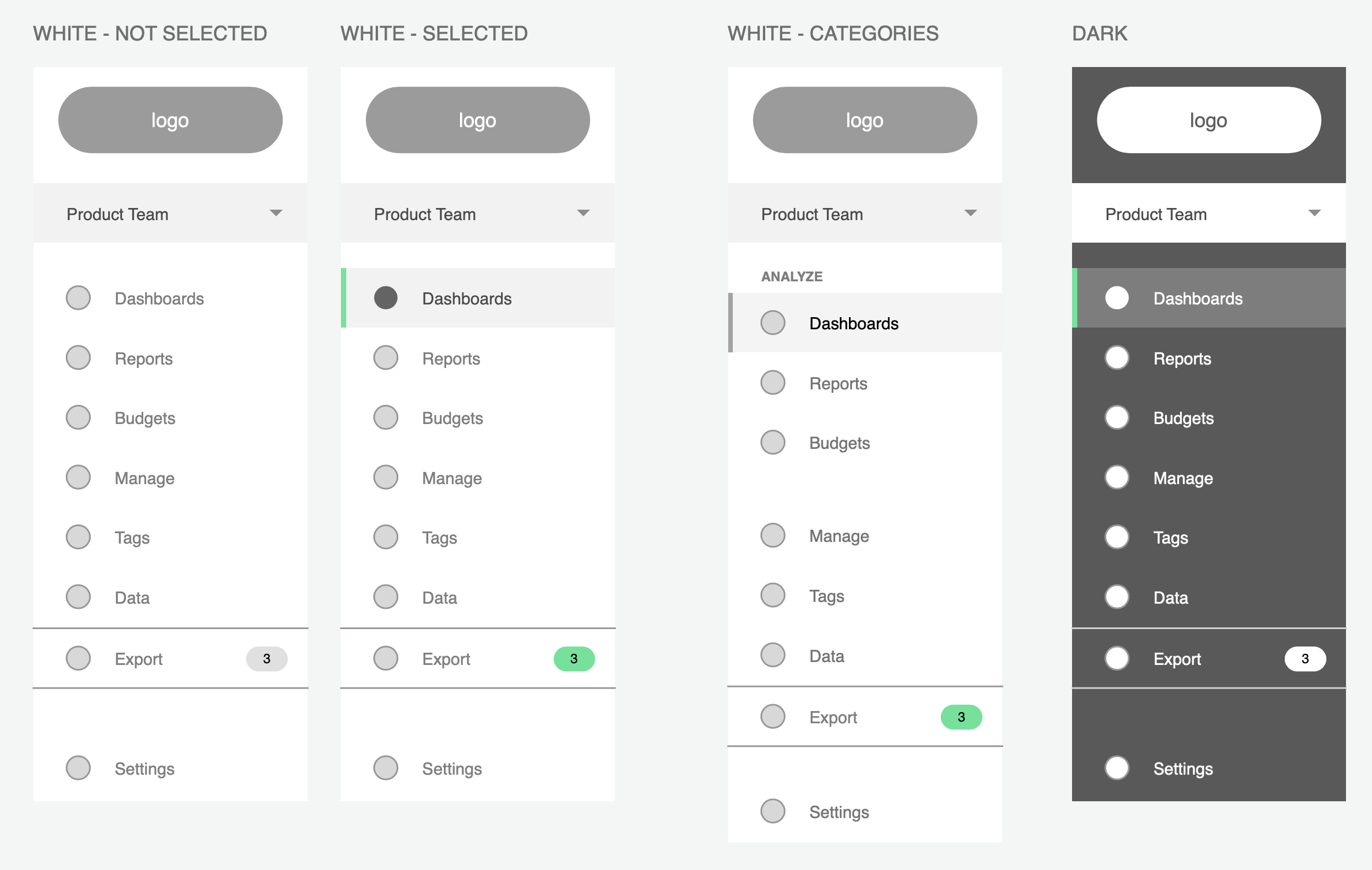
Sidebar initial concepts (hi-fi)
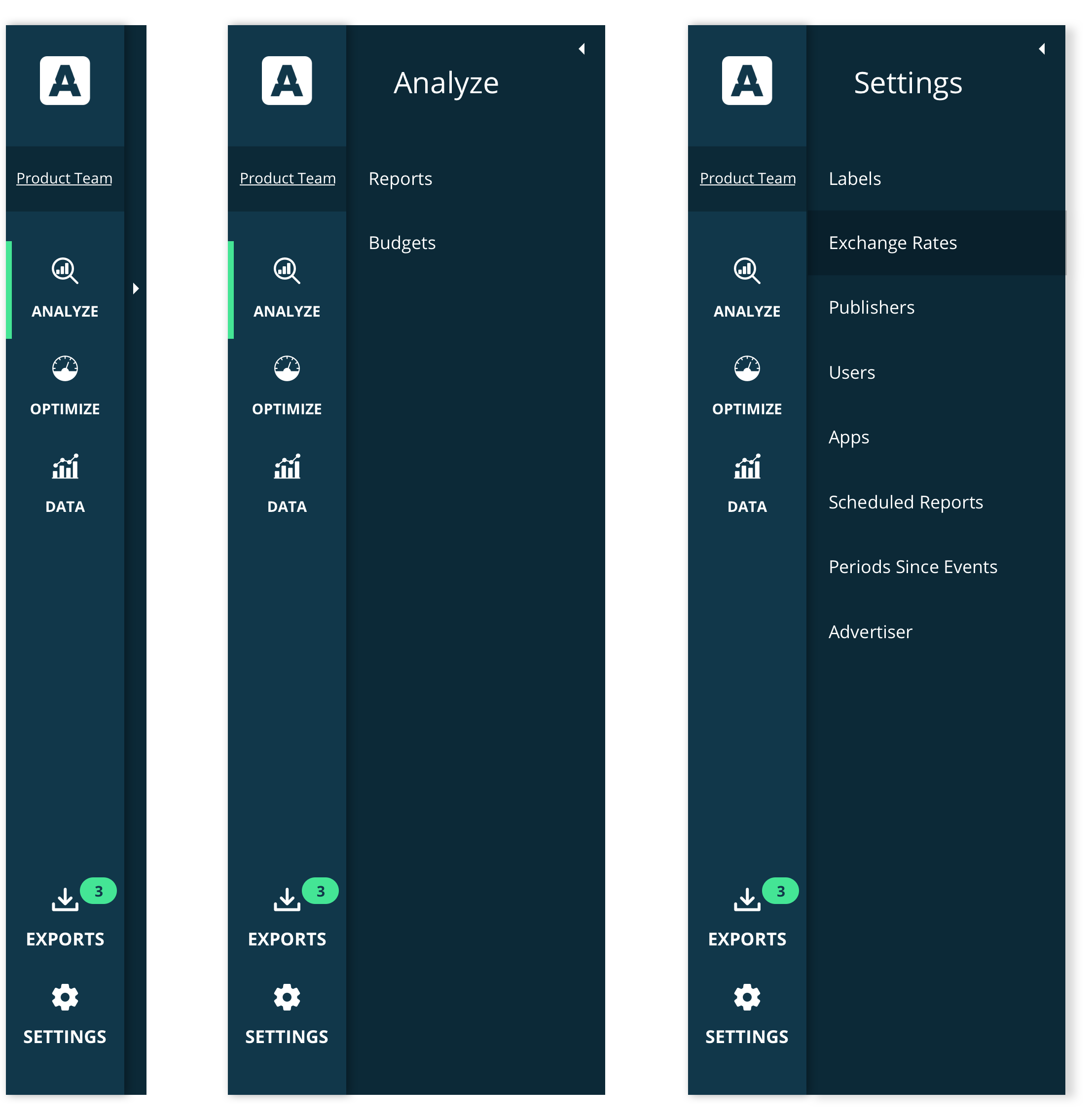
These first versions were exploring having a slide-out menu or secondary navigation from the sidebar. These would house the appropriate menu items. Once selected, the dashboard content or page would change.
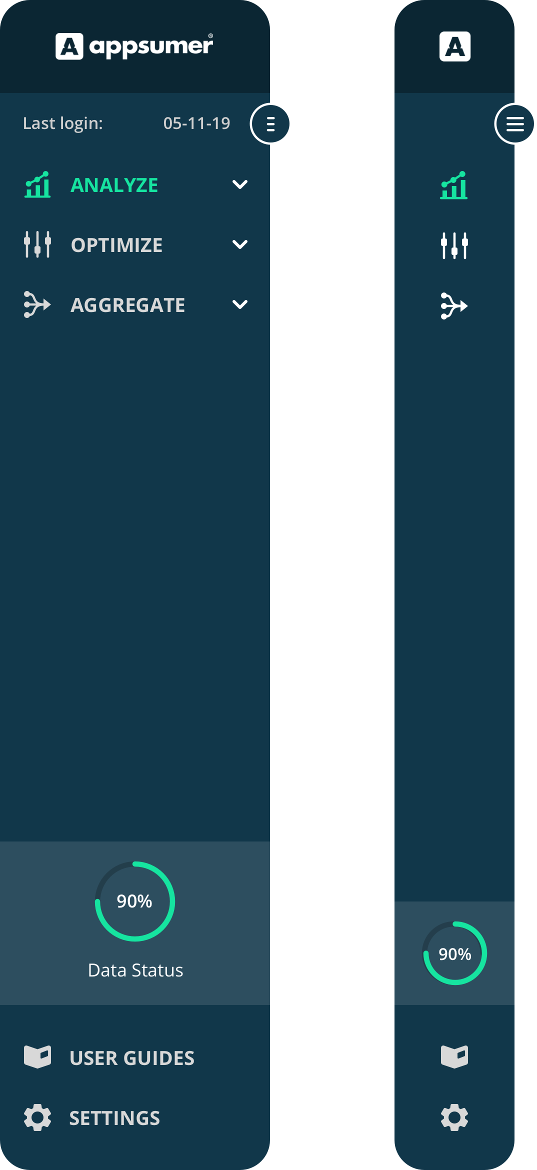
Sidebar - Final Design
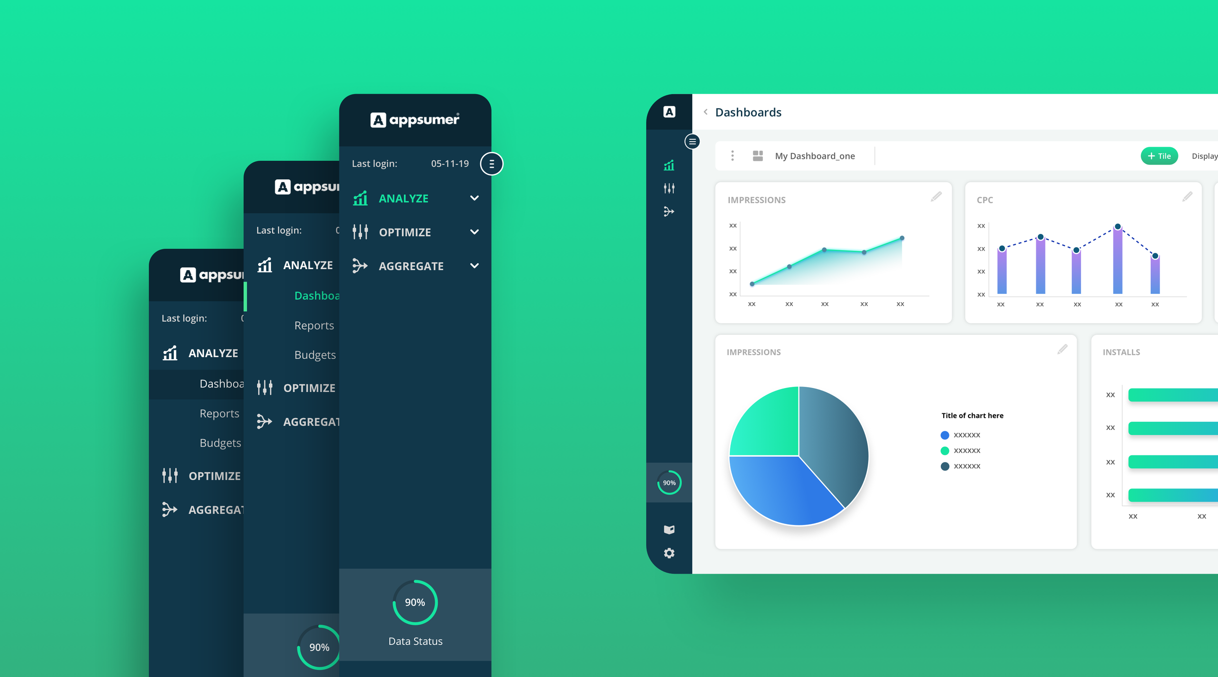
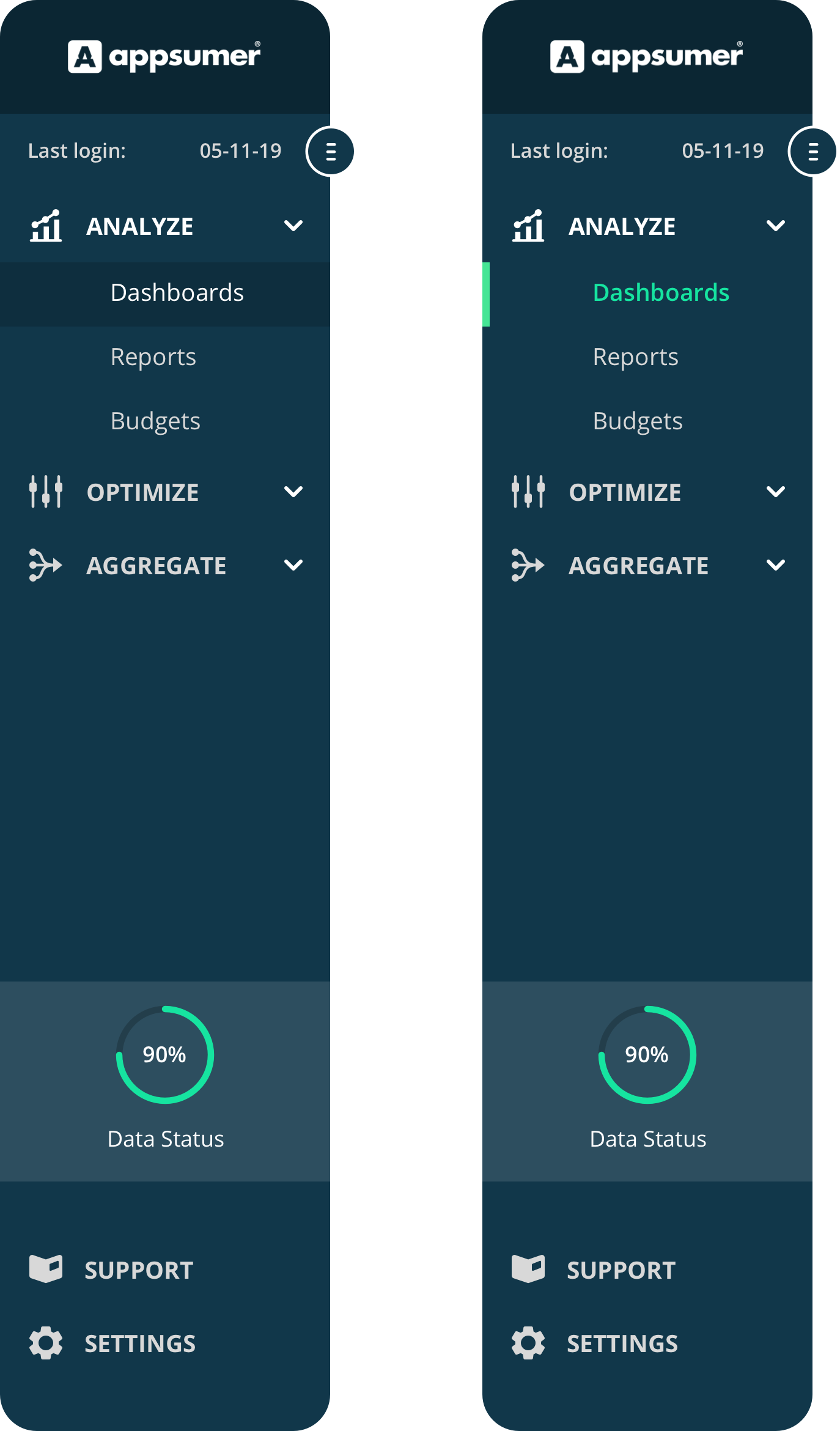
The new sidebar would capture and contain all the core features that Appsumer will have on its platform, and separate them into three main categories.
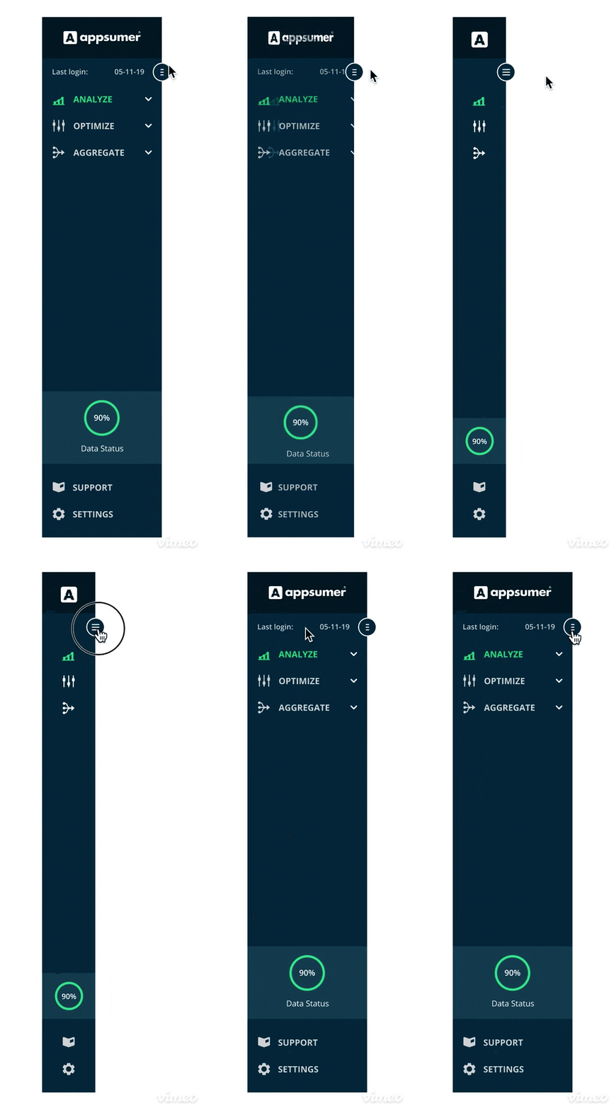
The option to have a expanded sidebar that could easily be made smaller by toggling the icon on the right, in which compacts it, was useful for clients who wanted to view more of their dashboard.
Settings options as well as the guides and FAQs, have been placed further down the sidebar, ensuring these are easier to find, rather than being in the same proximity than the core dashboard features.
Left - expanded (large)
Right - Compact (small)
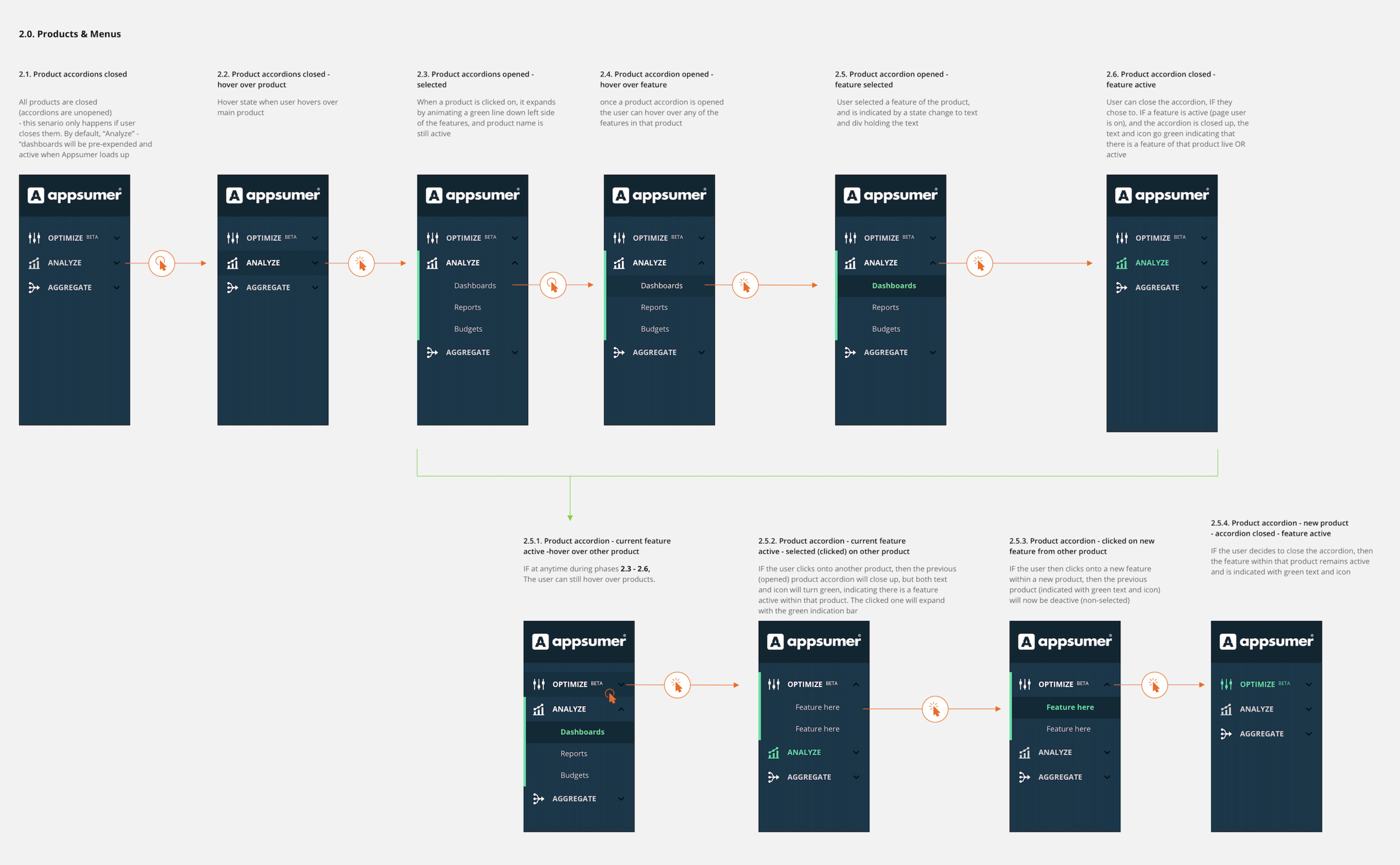
Open menu states and accordion items
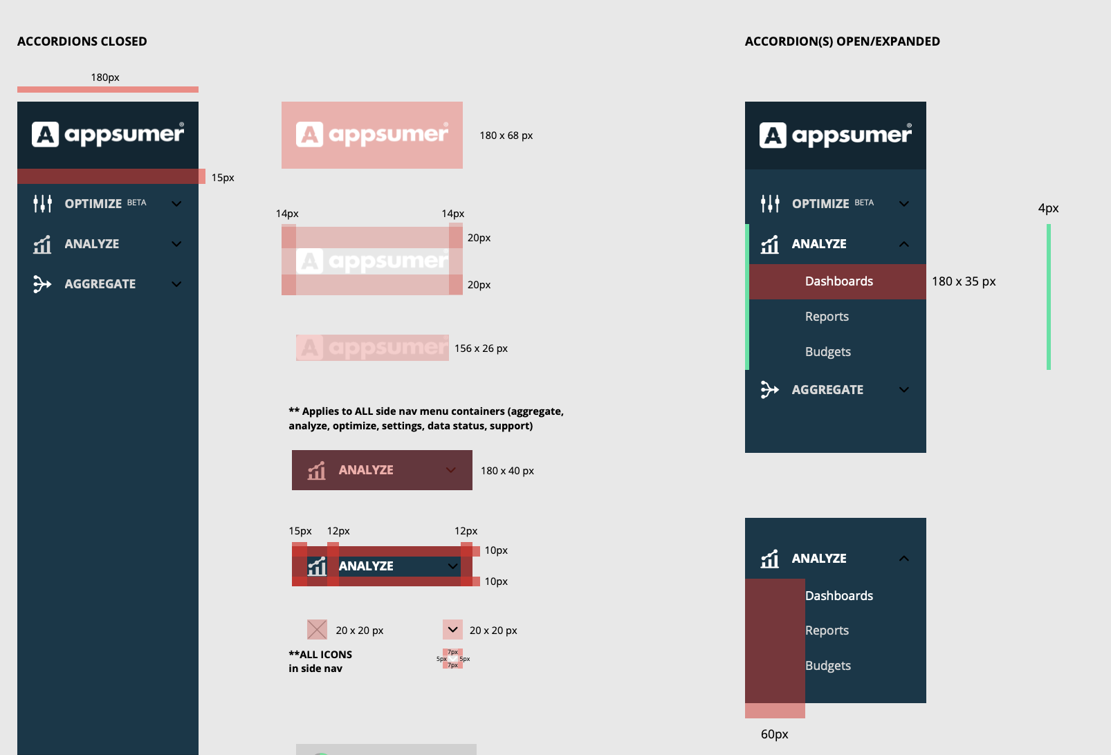
Sidebar IX (interaction flow) & specs
(1.2)
Top Bar & Functions Bar - current implementations
Top Bar
The top bar was used to solely state:
1. the name of the page/feature the user was one, if their data was live or ‘up-to-date’.
2. To access user profile and options
3. Live chat and support (beta)
4. To export the entire dashboard or view you were seeing on-screen

Functions Bar
The functions bar served as a tool that helped users alter or change variables of the on-screen data, format, layout, and visuals of the information on their current dashboard.
Problems with the functions bar were that it was too compact, housing too many options for the user at one level. It was confusing to clients to use as these would actually change depending on what feature was selected from the sidebar (i.e. ‘Reports’, ‘Budgets’ etc.), and the spacing between elements would shift.

Dashboard ‘view’ menu
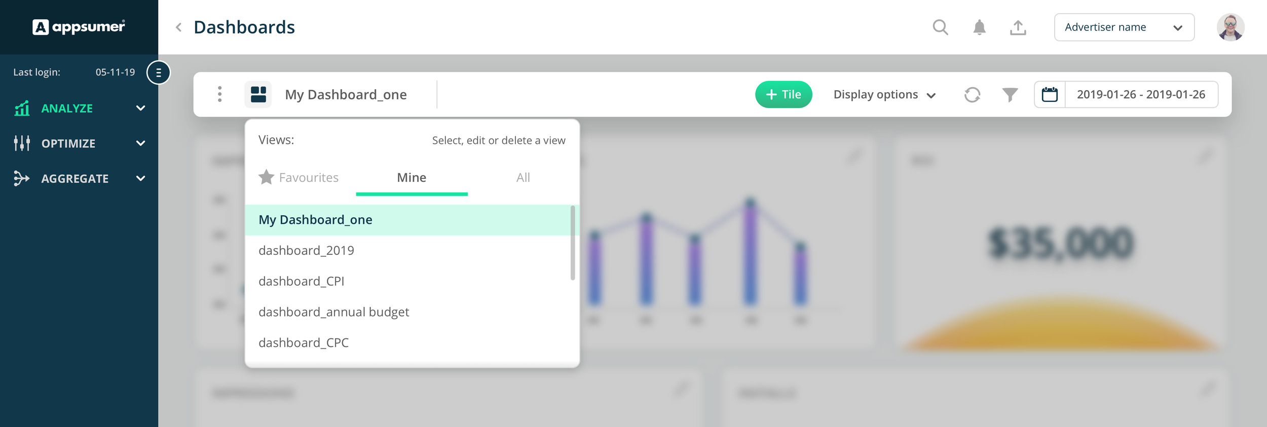
The ‘Select view’ menu was a way in which users could select the different ‘views’ or in other words arrangements of their dashboard. Depending on what dashboard was selected, it would show varying data in charts, tiles or widgets.
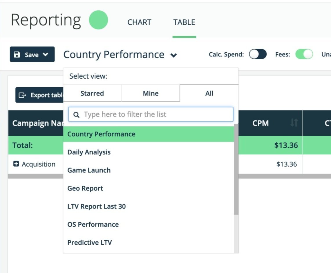
Top Bar, Features Bar & Menus - Final Design
The final design was split into two deliverables - one being the Top Bar, and other was the Features Bar.
The new Top Bar housed all the relevant options, from a new search feature, notifications, and downloads (or was known was exports). Hovering over each item would present more options to the user.
This design cut down the visual and cognitive overload of the previous implementation(s), and served more of a user-friendly interface, that other platforms (seen in research), had implemented. By using ‘basic’ icons which connect to mental modal tasks i.e. ‘bell’ icon is associated with notifications/alerts, it helped to design for a basic UI.

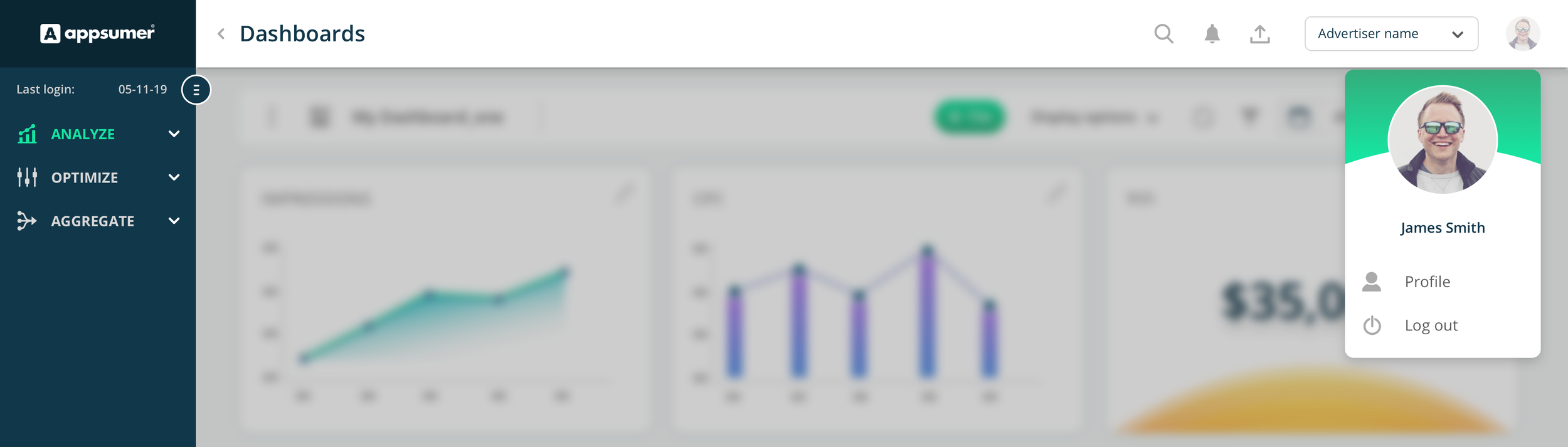
Profile pop-over
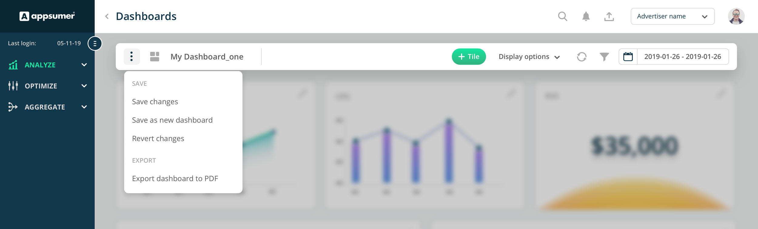
Dashboard options menu
New Dashboard ‘View selector’
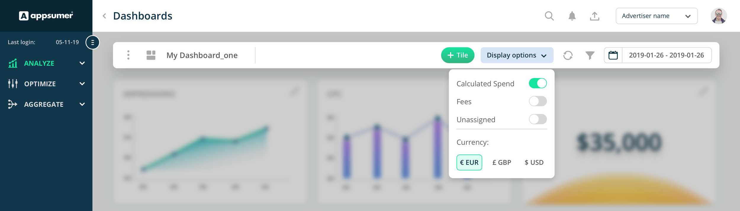
Display options
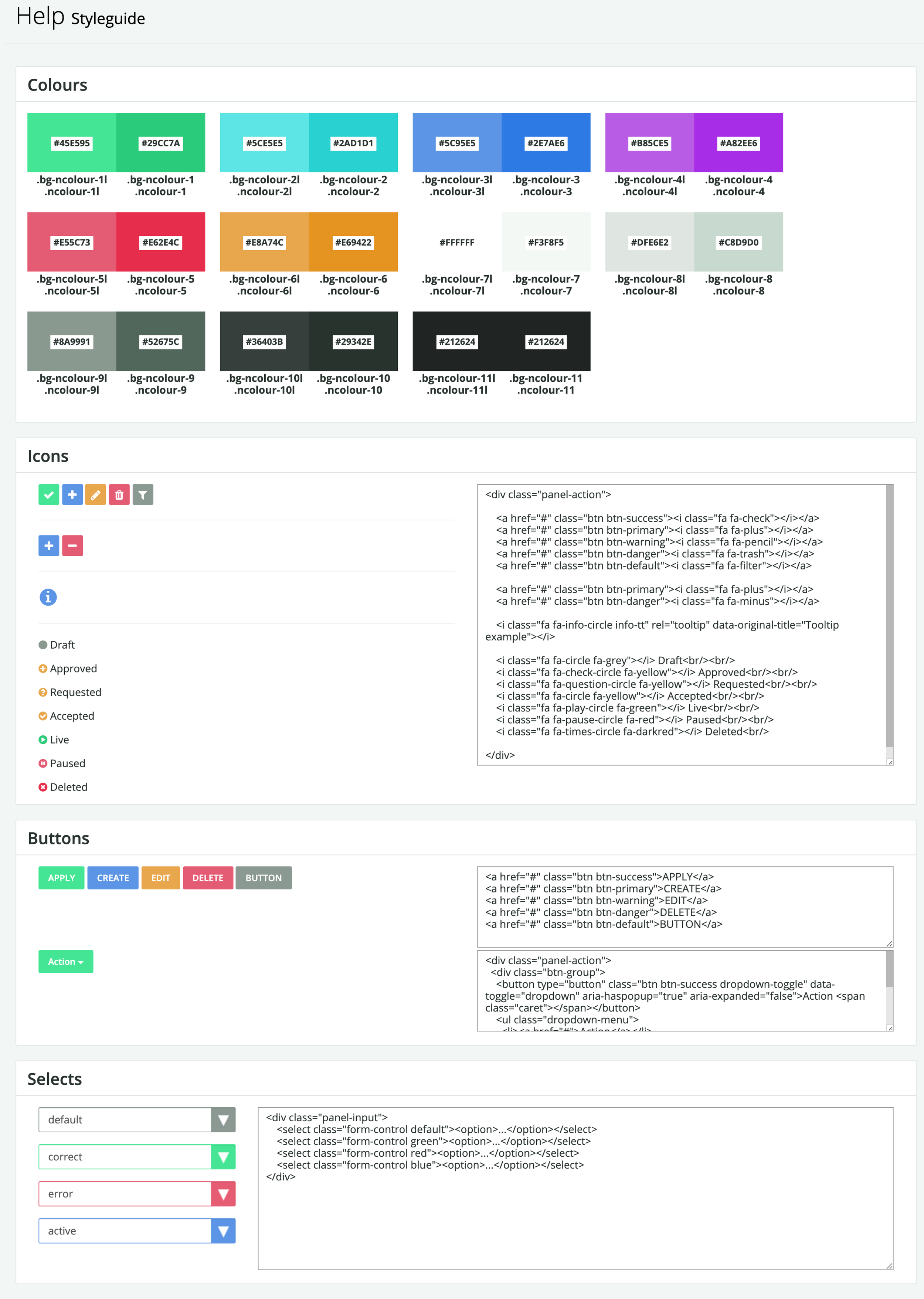
Old/Existing platform style guide:
The old style guide was implemented from a developers perspective, and not from a design perspective. So, a lot of the styling on the platform was inconsistent, or just non-existent.
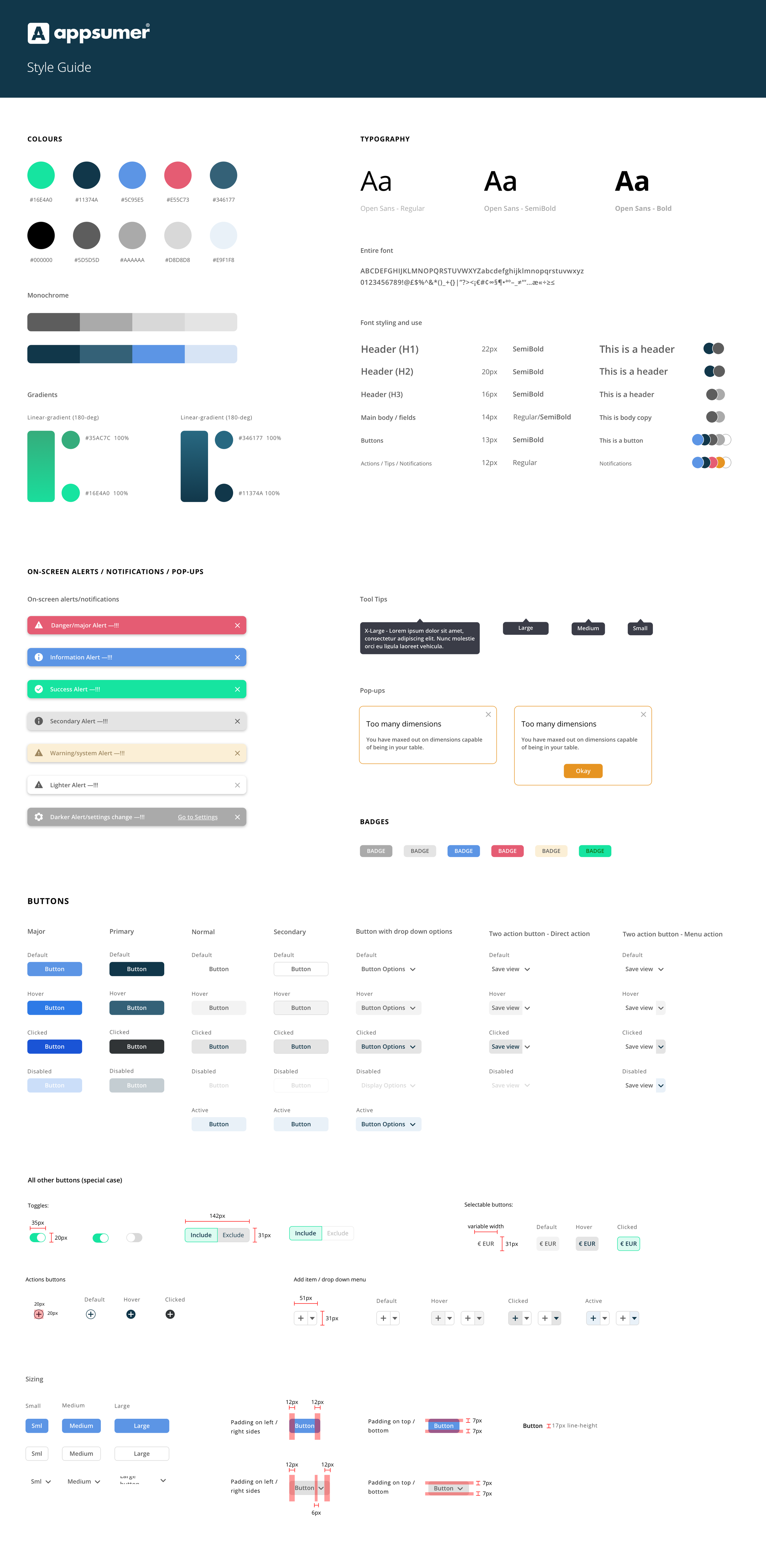
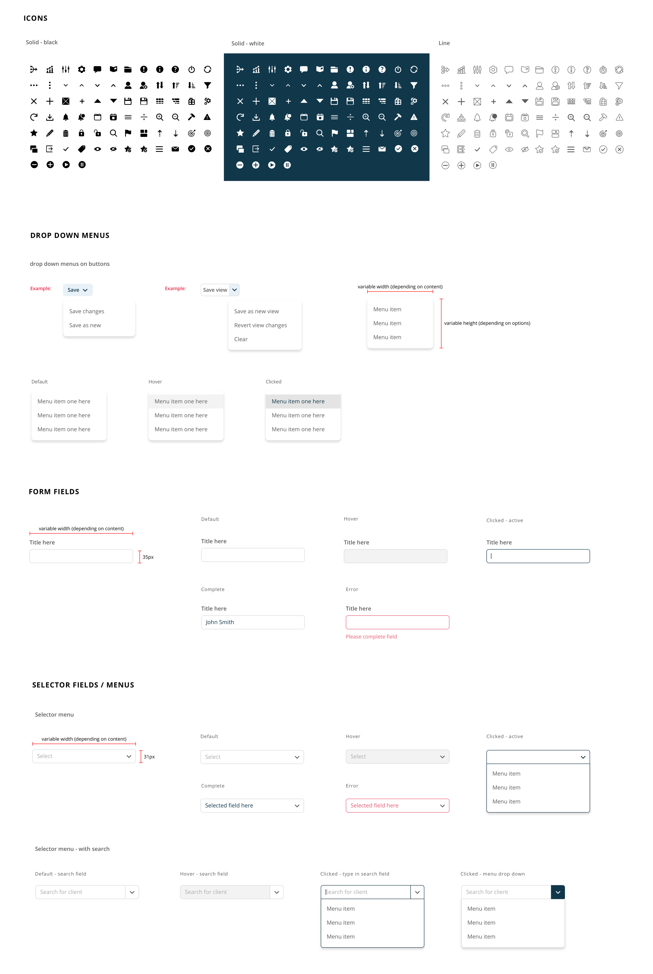
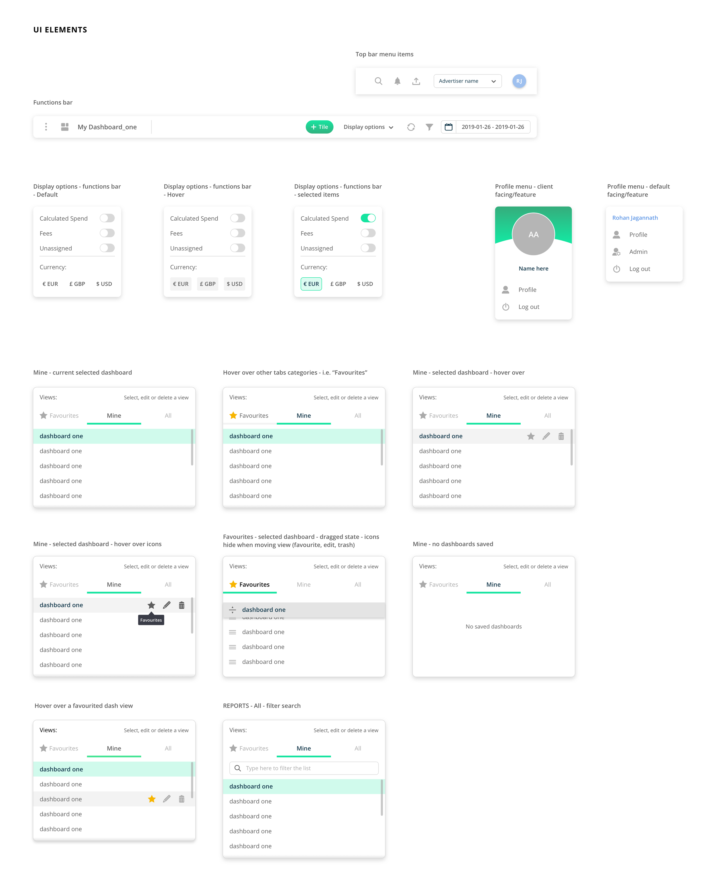
Having a limited style guide for such a complex platform - now growing - had to change, and I was tasked to create a new and improve guide, that would be adopted platform and site-wide (web site).
NEW Style Guide & Component Library
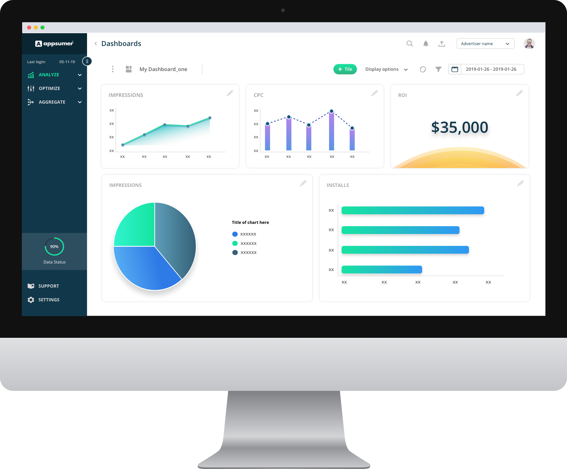
Final Dashboard design
The final design went through short, gorilla testing in-house and to clients to get their initial feedback. Once built, we were flooded by positive reviews and emails from our clients. The dashboard was clear, simple and easier to use - It did want it needed to do for clients. I didn’t want it to be so different and vary from the original implementation too much, as it would lead to user fatigue and problems with the UX later. It just had to be striped from all the visual buttons, actions and options presented all at once for the user, nestled in the appropriate areas of the dashboard.
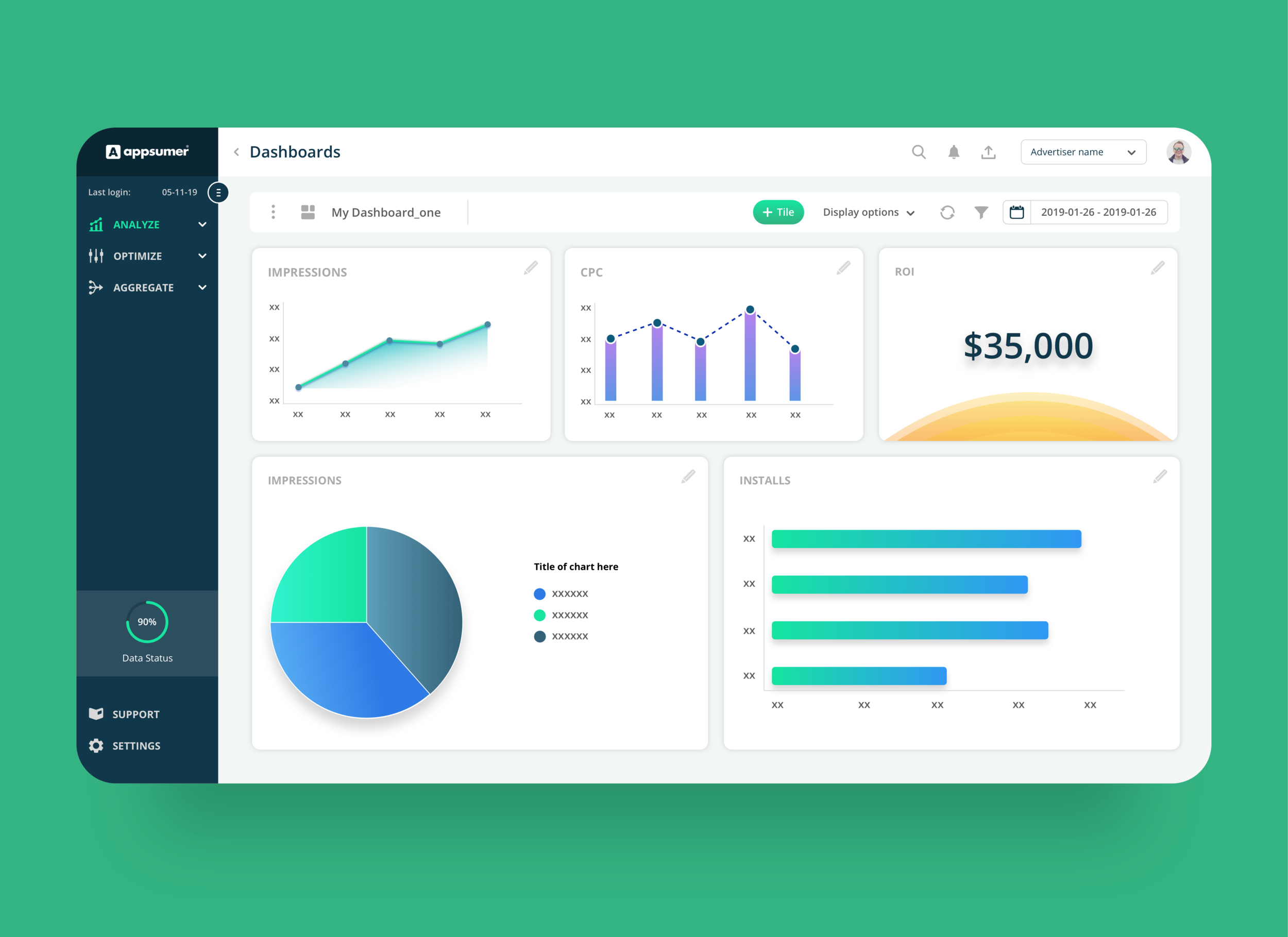
"Really awesome! So simple to use now for us. The new look and feel of the Dashboard is so refreshing…"
— Miniclip
2.0
Profile page
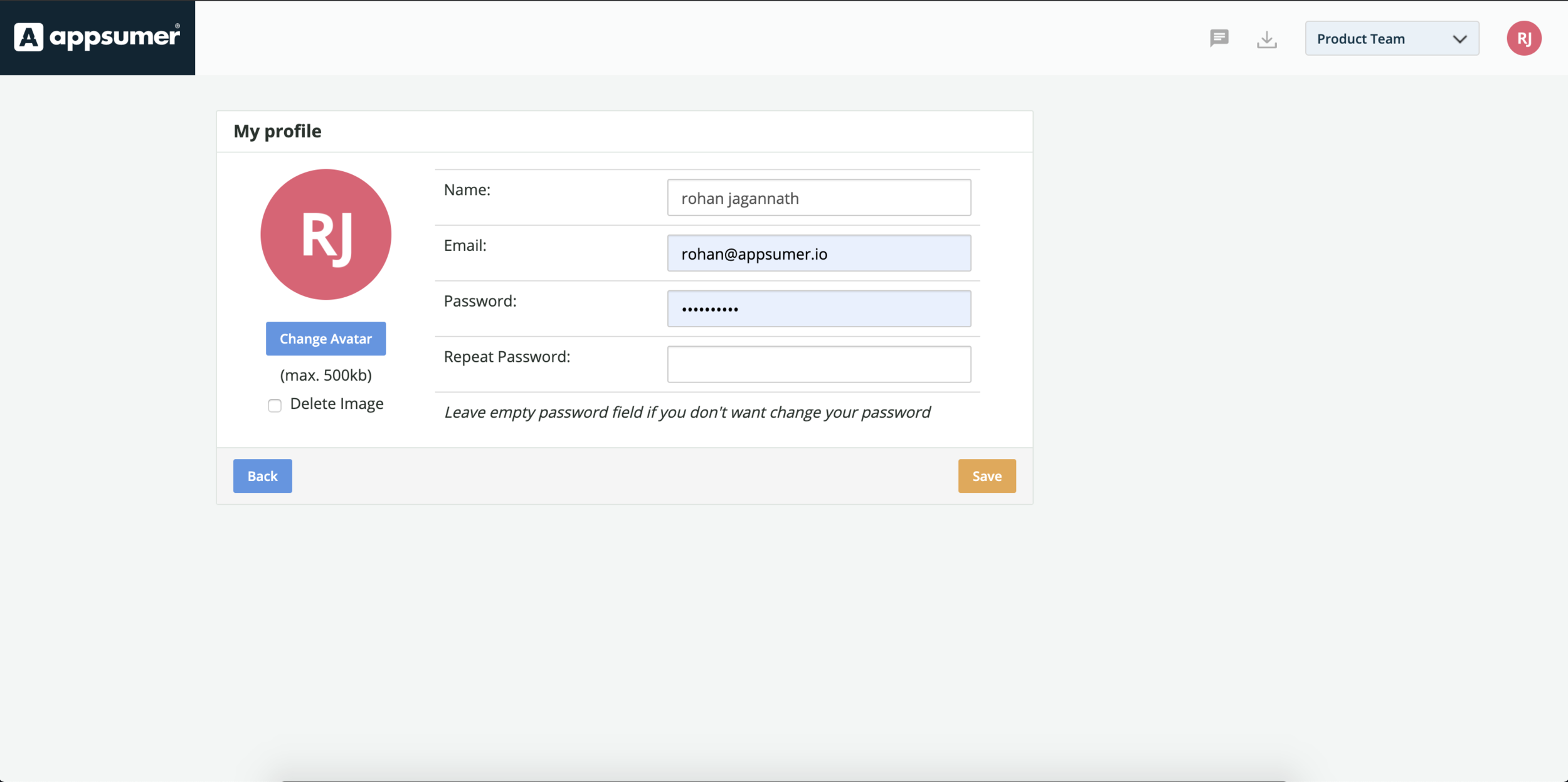
Existing Profile Page
The existing profile page was extremely basic, only allowing the user to perform two main tasks: one to change their avatar (profile pic), and the other to change basic information such as name, email and password.
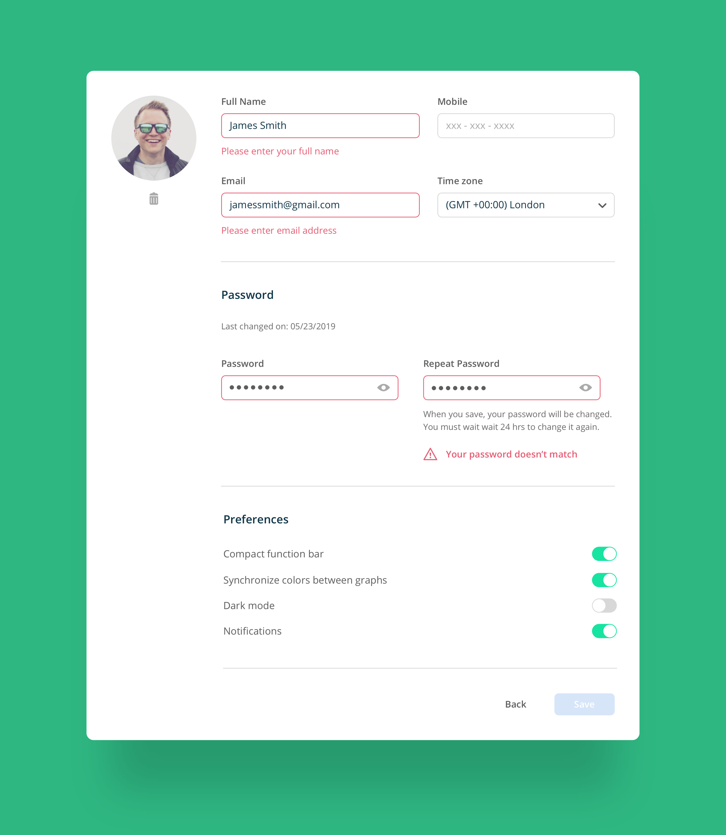
In terms of the user experience, it was missing vital form error states, for example when a user inputs a email without the use of the ‘@’ symbol - there was no error for that. Also, when a user would change their password, there was no option to view the field when user types in current/new password. So, these UX patterns had to be taken into consideration, to ensure the experience is better suited for a profile screen.
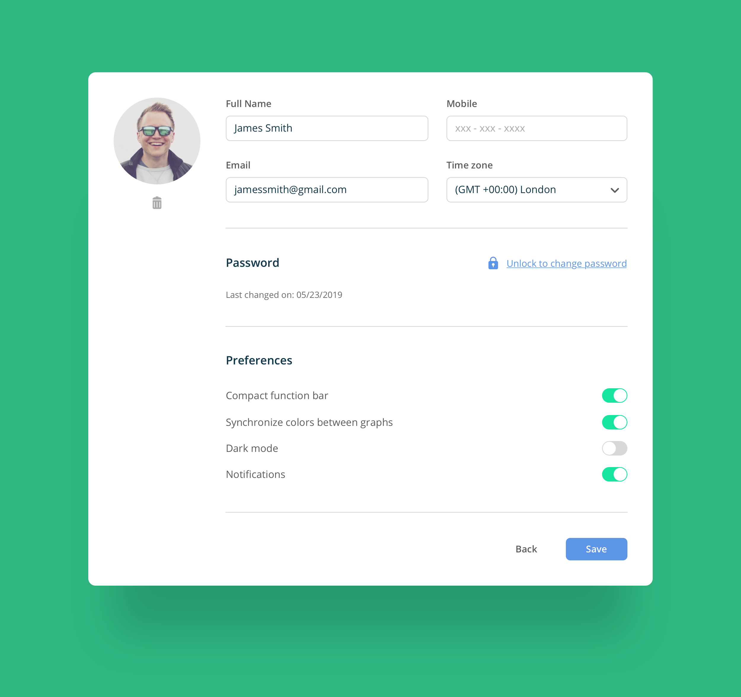
Profile Page - final design
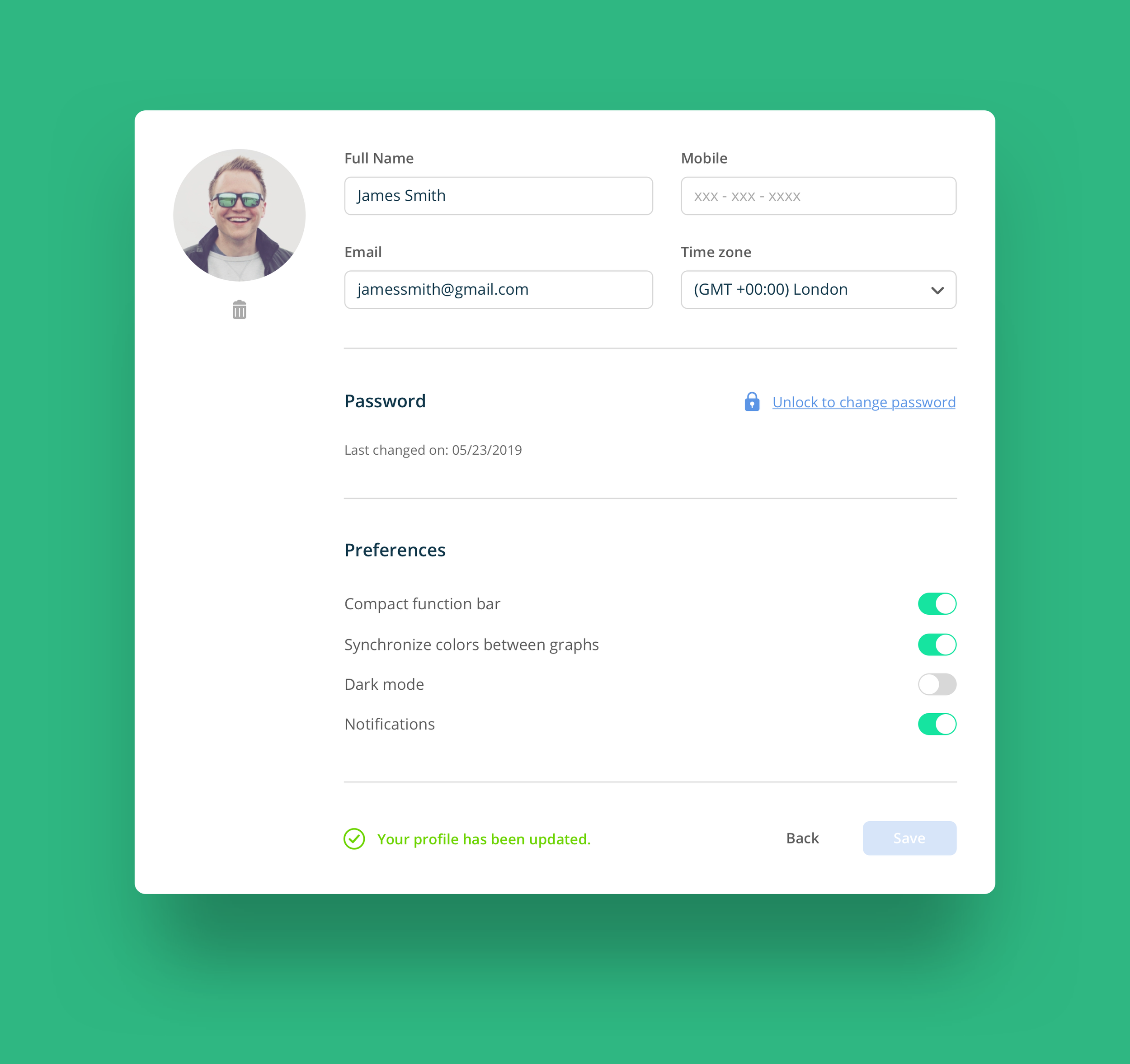
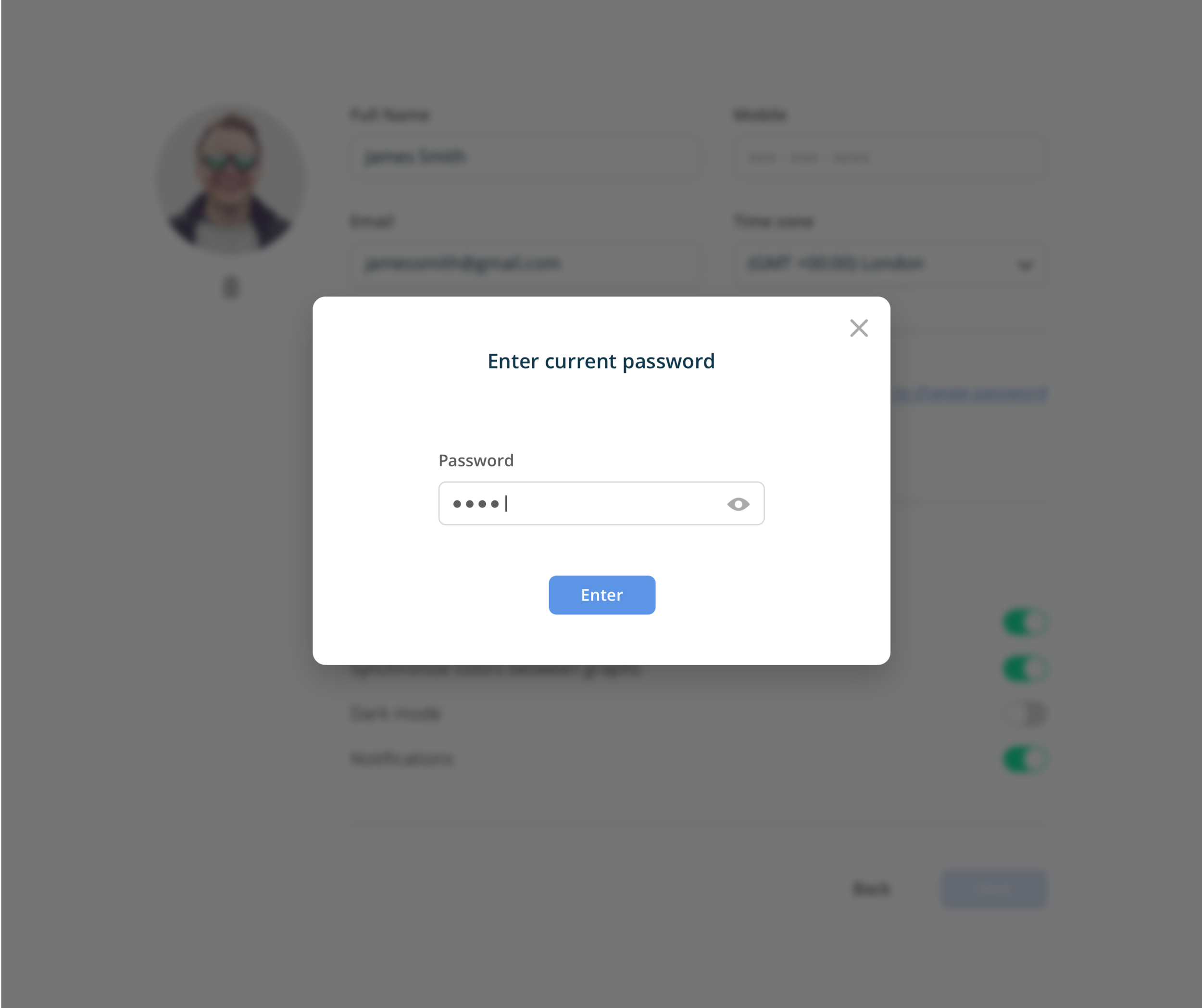
The new design for the profile page, addresses a majority of the ux problems the existing profile page was suffering with. There is now clear form fields for the user to input/edit their credentials and information. The password section now states when the user had lasted changed it, and for extra protection, they now have to enter their existing password in order to create a new password. The hide/show password also helps the users see what they are typing in, and eliminates that use case of them typing something different/wrong.
Once the user has changed or edited any of the existing profile information (name, profile image, password, or preferences), the ‘Save’ button is then active - indicating they’ve made changes. Once updated, a confirmation would be displayed at the bottom.
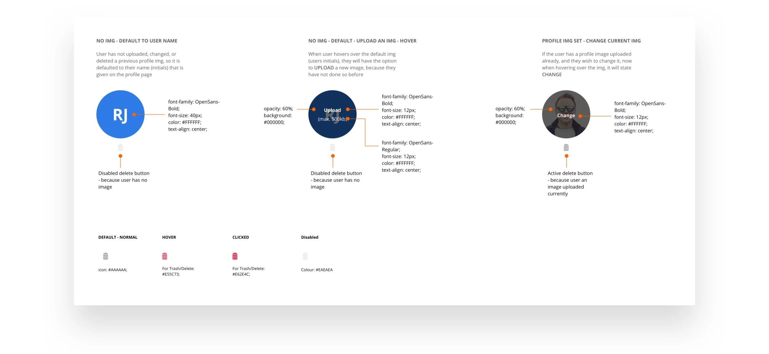
Profile image states
3.0
Login & Setup
Login and Setup flow - current implementations
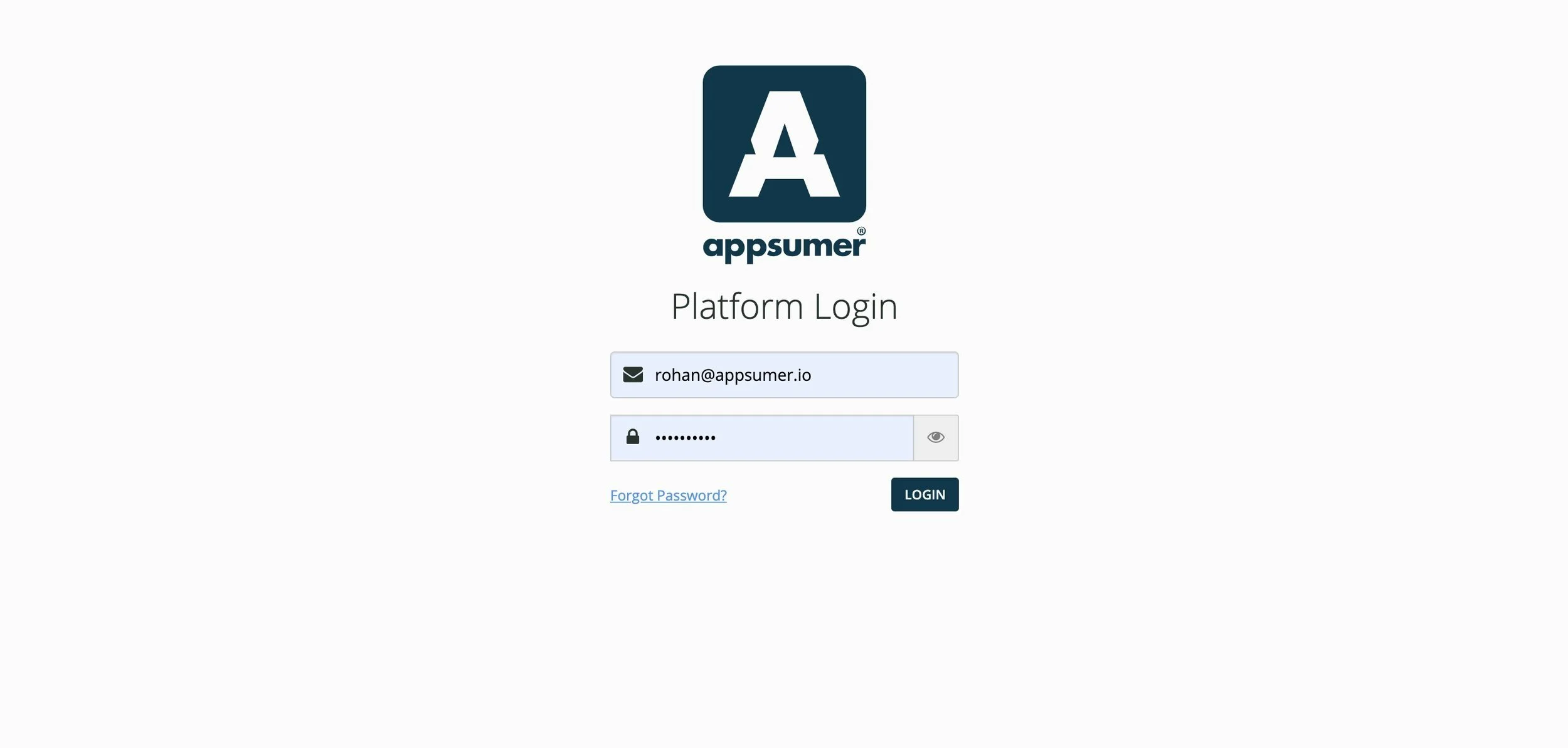
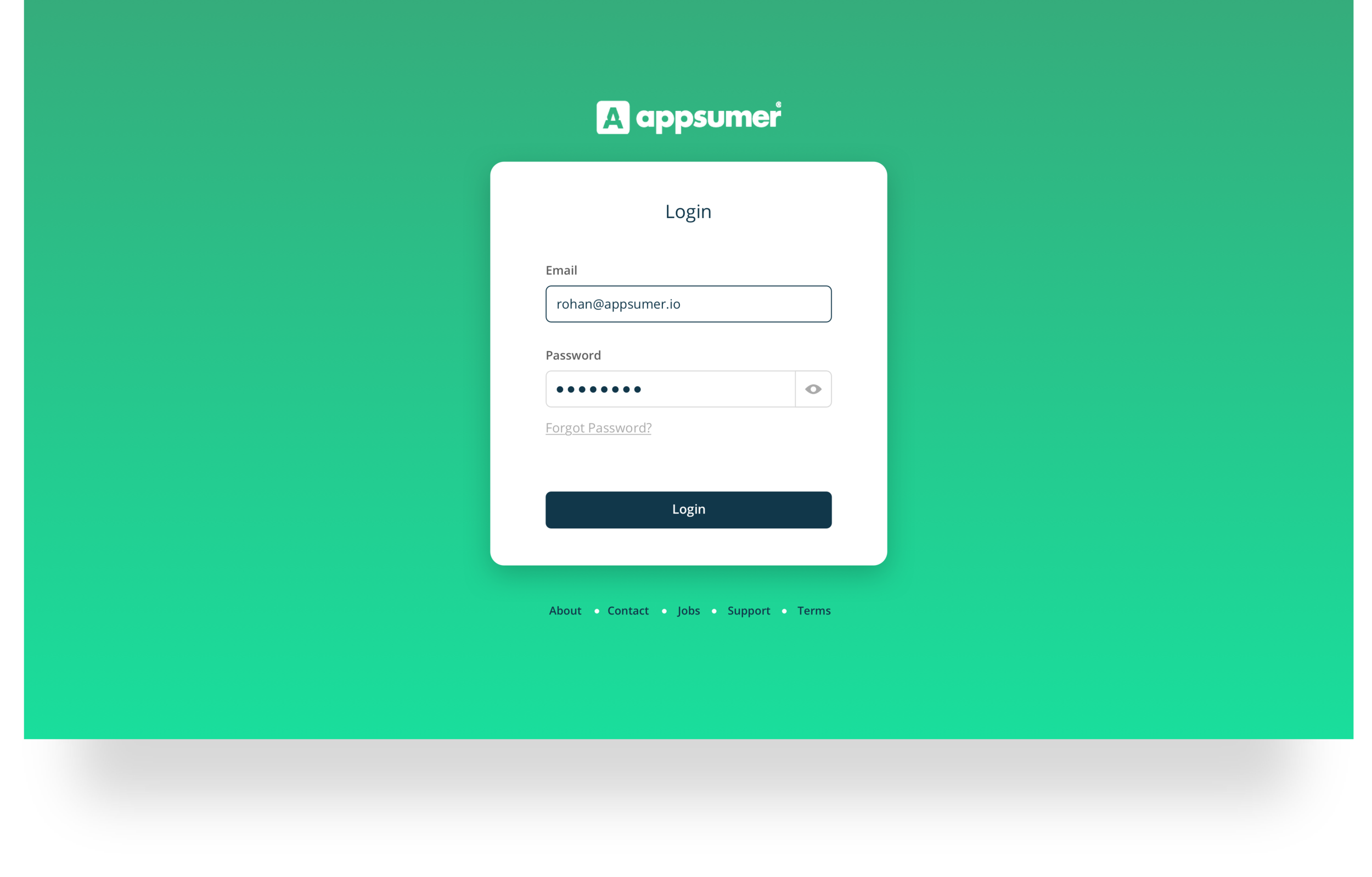
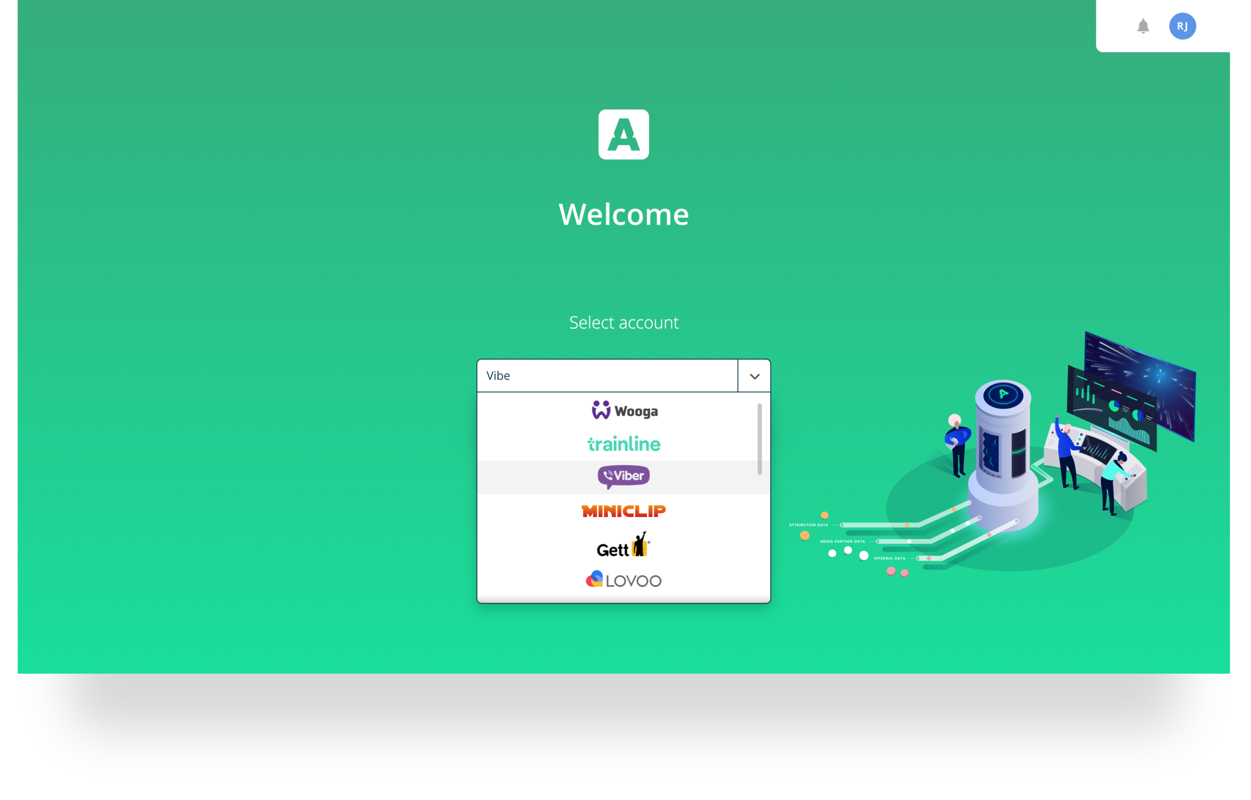
Like the profile page, the login and setup screens needed more visual appeal, and branding, since this is the first step(s) and tasks users take in their journey to get onto the platform.
Login screen
Setup screen
Login screen - final design
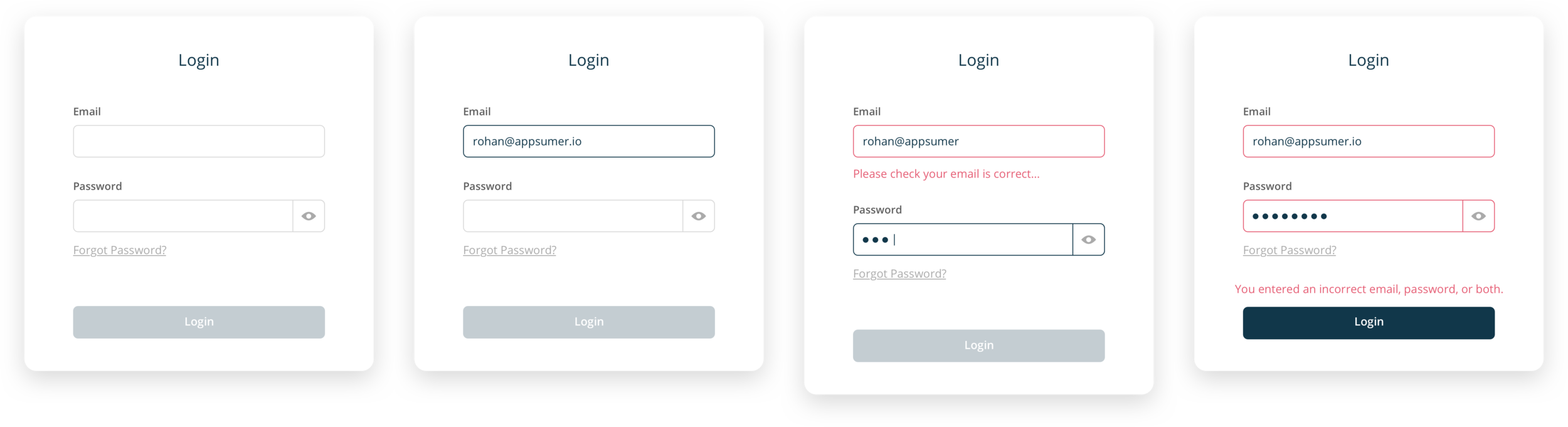
Form states
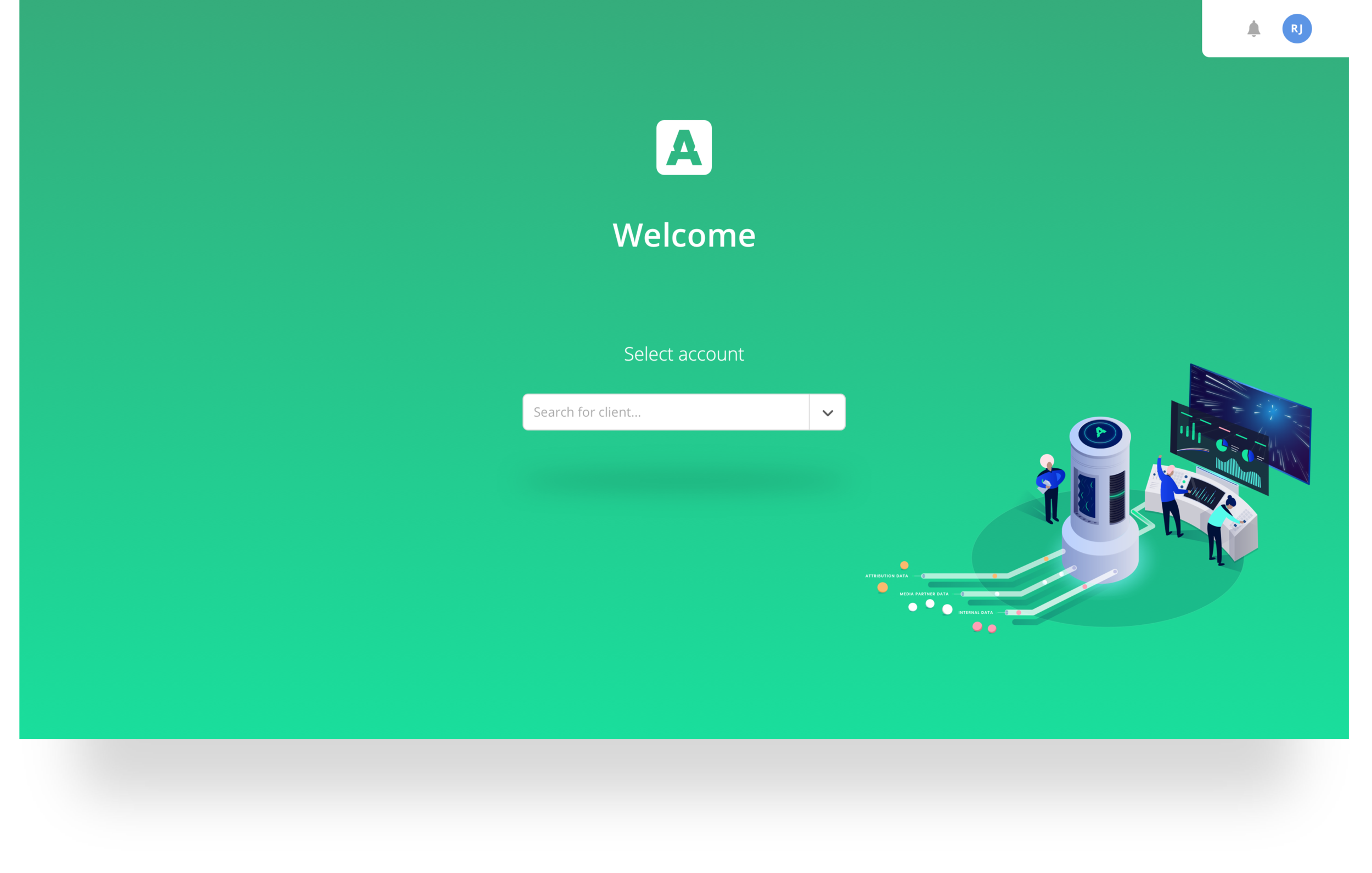
Setup screen - final design
Reflection
Over the 6-7 months at Appsumer, I manage to design, build and test new exciting features and pages to help the platform grow and expand in the market. It was a great experience working with the talented engineering, data and product teams, to craft amazing journeys for this platform. We were overwhelmed with the amount of praise and feedback from the clients, stating they loved what we’d done with the dashboard, login, profile screens, and integrations setup/flow (not shown in this case study). At times, it was fast pace, demanding and more often than not, exciting - we didn’t know what challenge would be next or new crazy feature we’d explore first.